Drinkaware
IA Restructure
Reimagining the Drinkaware website information architecture in order to streamline and simplify user journeys
Overview
The Challenge
The Drinkaware website contains a vast amount of content and resources that has grown over the years with little done to update the website structure and maintain ease of navigation and user journeys.
This has resulted in convoluted content categorisation, a high bounce rate from the home page, high drop off rates throughout the site, incomplete user journeys, and overall poor user experience.
The Goal
Improve overall user experience, reduce bounce and drop off rates and ensure users can find the content they are looking for through a restructuring of the Drinkaware website and improved user journeys.
Suggested structure saw 33% increase in users’ ability to navigate the site
Project Timeline: January - April 2022
Role: Project Lead, User Research & UX Design
Deliverables: Site evaluation report, Test plan, Site maps, User Testing analysis, Insights & Recommendations report
Project Objectives:
Evaluate the Drinkaware site structure to assess how well users are able to find content. Provide recommendations on how the website can be restructured in order to optimise user experience.
Recategorise website content to improve findability for users and enhance user experience.
Conduct natural language testing to ensure clear, relatable language is being used in labelling and categorising content to improve search functionality within the website and external SEO.
Phase 1 - Audit & Analysis
Gaining a thorough understanding of the Drinkaware website’s current state, and how user experience on the site was performing.
Google Analytics Audit
I conducted a Google Analytics audit of the site’s 2021 performance with the aim to gain an understanding of three key metrics:
User entry points
1
User Journeys
2
Drop off points
3
This analysis showed that while the Drinkaware website was receiving high traffic and return users, there were very few journeys being taken through the website’s content.
The majority of pages were experiencing high bounce and exit rates
User sessions were short with an average of 1.49 pages viewed per session
User journeys were short and fragmented, with no clear trend
77% bounce rate from homepage throughout 2021
Site Map
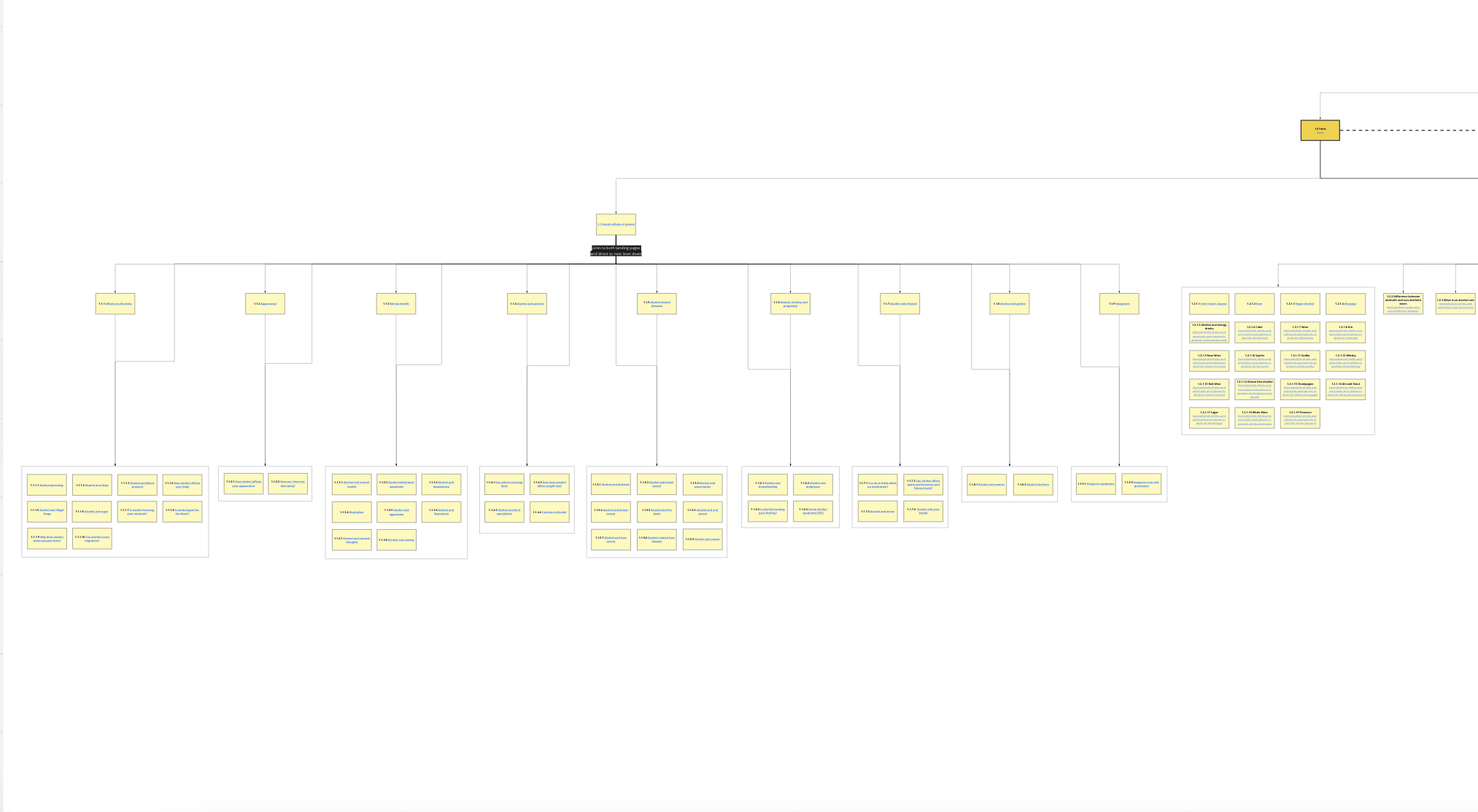
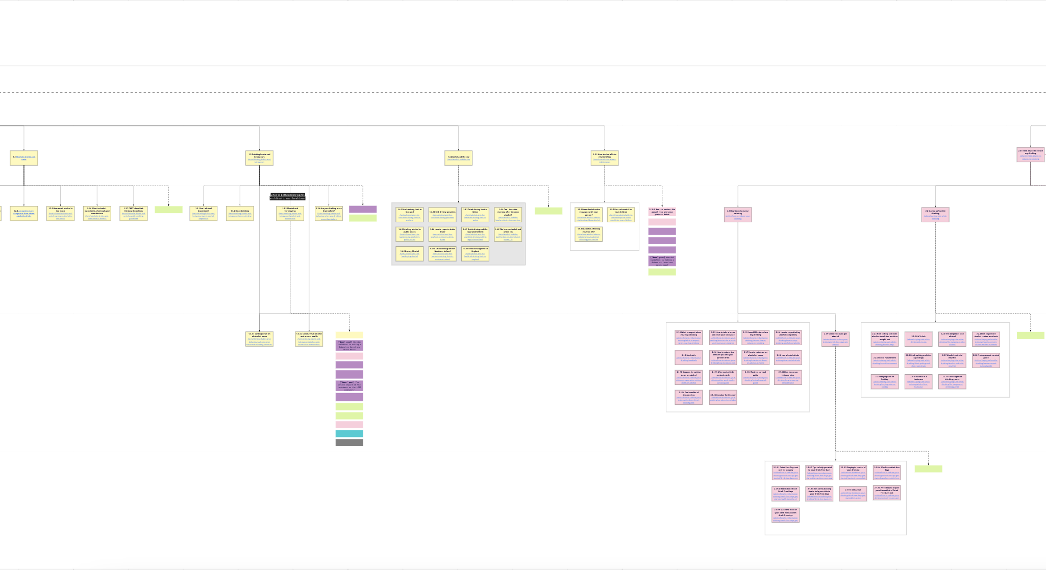
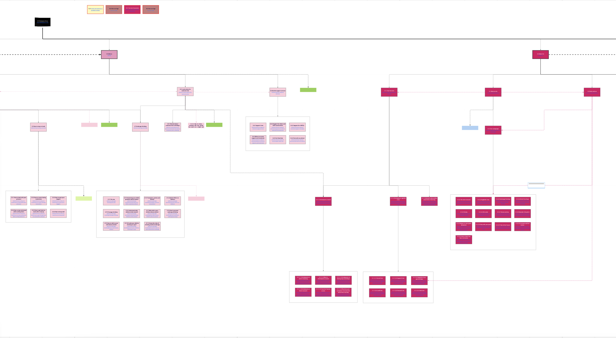
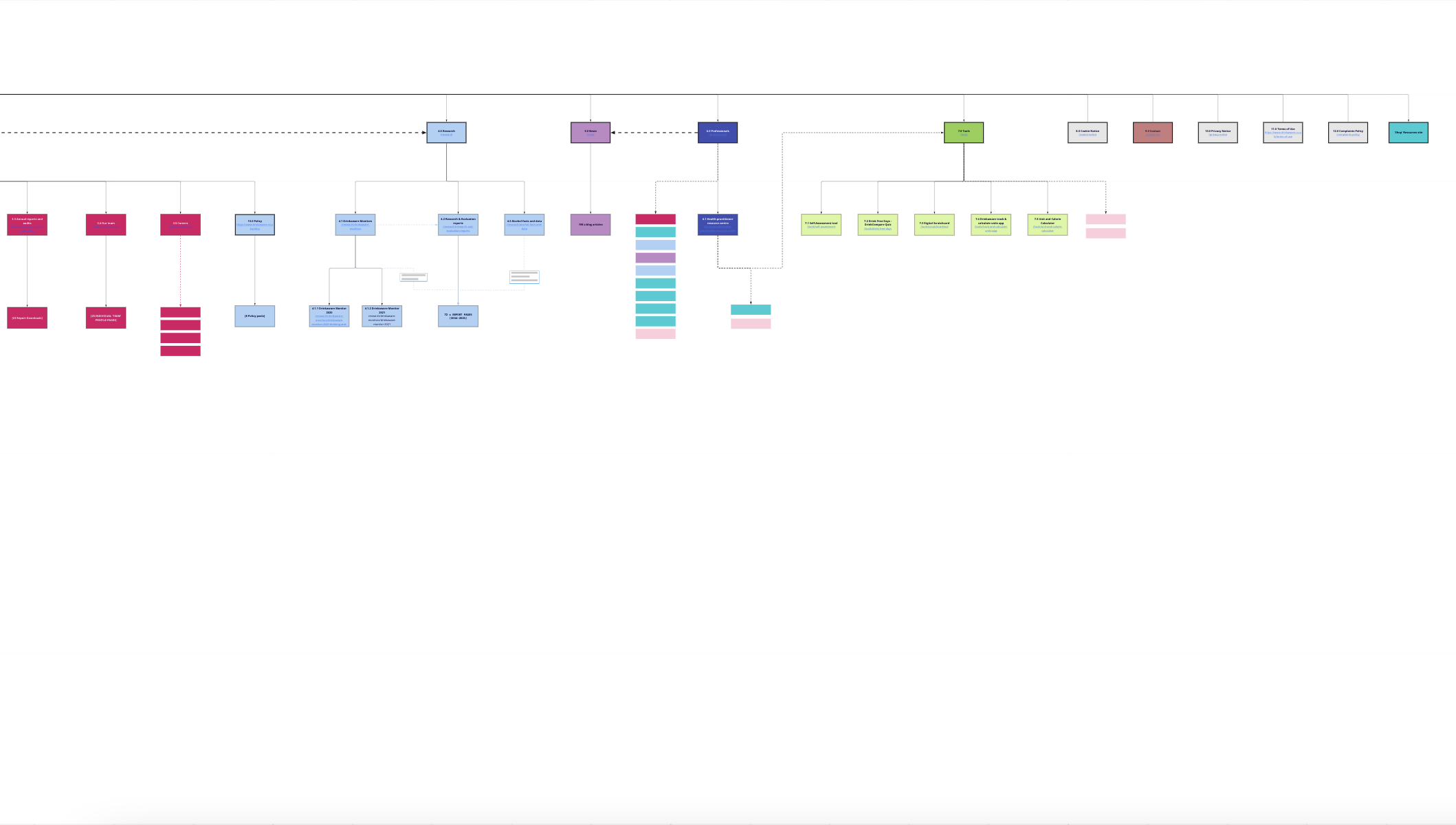
To fully understand the existing IA structure of the site, I performed a site crawl with Screaming Frog. This data enabled me to develop a visual site map in order to easily see what journeys were currently available to users, and help pinpoint why users may not be navigating through the site with ease.
I used this site map as a visual aid to validate the project to internal stakeholders and highlight why the project was important to undertake to both improve on site user experience and help support the overall business objectives of Drinkaware for 2022.


From the site map it was clear to see the overwhelming amount of content and various journeys open to users visiting Drinkaware.
512
Individual pages
19
Homepage CTAs
7
Levels of content
Content existed on the site up to seven layers deep, with related content often split over various pages and no clear progression from one area of the site to the next.
If landing directly on the homepage, users were presented with 19 CTAs on top of three menus presenting almost the entire site to users at once, with overwhelming choice and no clear direction.
Tree Testing
To validate the data gathered from Google Analytics, it was important to perform user testing on the Drinkaware website in its existing state. I chose to conduct this via a remote Tree Testing exercise hosted on the OptimalWorkshop platform.
This exercise would be able to show us;
how users instinctively navigate through the existing IA
if they were able to find the information they were seeking
where they may be getting ‘lost’ on the site
A set of tasks was developed in order to cover the predicted journeys of a range of Drinkaware’s target user groups. Each of the 22 participants completed a remote tree testing exercise with 10 tasks, covering various user scenarios and content sections of the website.
The test results overwhelmingly backed up the data gathered, with high fail rates on all of the user tasks and only 20% success rate overall.
When asked to rate the ease of completing each task, the majority of participants had rated the tasks within the range of 1 (very difficult) to 3 (average).
Each task was individually analysed to understand the various journeys participants had taken while trying to complete the task, whether there were any repeating patterns , and which areas may require further testing to gain a deeper understandings of its pain points
Recommendations for further testing were proposed for each task, to be taken into consideration during the following rounds of user tests and final recommendations.
Phase 2 - Discovery
With the initial analysis stage complete and areas for improvement clearly highlighted, additional rounds of user testing were undertaken to discover insight into how our users may naturally categorise Drinkaware’s web content.
Open card sorting
Following on from the results of the tree test and analysis, an open card sorting session would enable us to understand how users would instinctively organise the content of the website in a way that makes sense to them.
This would help to begin generating ideas for the new IA, establish if our different user groups sorted topics differently, and give some initial insights into the language our users naturally use.
I conducted two tests via the OptimalWorkshop platform;
External participants with no prior familiarity with Drinkaware
1
Internal Drinkaware stakeholders
2
The comparison of these two tests would allow me to draw comparisons between user vs. stakeholder expectations of the website, and compare whether Drinkaware is using language that reflects that of its users.
Participants were asked to sort 54 cards representing the broad spread of topics across the Drinkaware website into categories that made the most sense to them.
As was somewhat expected, external participants created a broad range of categories, while internal participants were more succinct with categorisations.
Following a process of standardisation of the external participants’ categories, there were some distinct similarities within the broad category themes created by both external and internal participants.
External participants’ 3D cluster view
Internal participants’ 3D cluster view
Six general themes were pulled out from the open card sorting, however further questions remained which required further research to establish;
Which themes make the most sense as overarching categories for information?
What subcategory groupings could be formed within these categories to organise topics in the most logical way?
Language Analysis
Before moving to Phase 3 of the project, it was important to understand the natural language predilections of our users to ensure that which we use on the Drinkaware site matches.
The language used in naming pages and categories throughout the web information architecture is crucial to ensure users are able to easily recognise topics they are looking for and make their way through the website’s content.
I undertook an analysis of a range of sources to draw insights on our users’ natural language tendencies:
Open card sort categories
Search terms entered into Google that lead to Drinkaware
Drinkaware chatbot conversations
Drinkaware’s internal search function
Phase 3 - Ideation & Recommendations
Currently in progress, in Phase 3 of the project I am beginning to ideate possible solutions to the Drinkaware Information Architecture. I am currently in the process of undertaking a Closed Card Sort exercise with both external and internal participants using categories developed through the open card sorting and language analysis.


